!!!
February 11th, 2012
Tags: Jeremy Lin, Linsanity, New York, simultaneously shattering and confirming all asian stereotypes
Posted in architecture | No Comments »

I’ve been working on a couple of houses for Diller Scofidio +Renfro these past several months, and I know what you’re thinking: DS+R does houses? Well, yes, they do. Or at least, yes, they are doing some right now, even though they haven’t in a long time. Or ever, really.
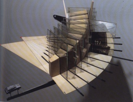
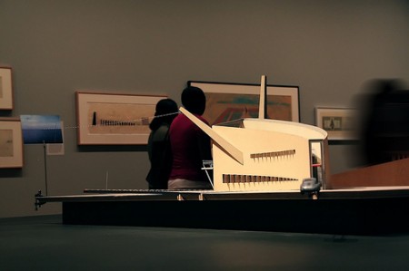
But it’s funny, because when you think about it, a large part of this firm’s reputation was built off of the success of one particular house project: the Slow House. The original models of the Slow House still sit in various corners of the office, and every student who has gone through architecture school knows that project. And it’s still spoken of fondly in this office, a kind of happy ghost from an early era.
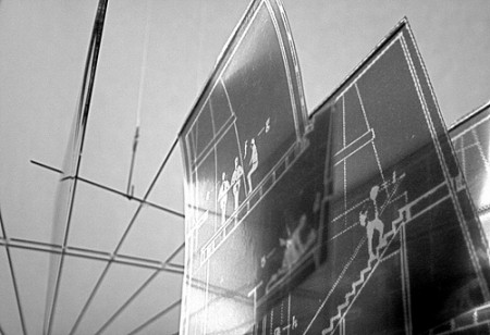
Now, of course, Lincoln Center and the High Line and the other recent (and future) Manhattan-based projects have become the germ from which most of our current projects stem, but these two new houses are a place for some architectural thinking that can only really be done on that scale, with that kind of client and program. And the office’s ideas and aesthetics have changed as well, and the pace and freedom of a small residential project is an exciting place to try out our ideas.
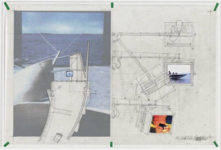
The whole point of this, though, is to point towards a website that I find continually great, and that I keep bumping into whenever I have to squat on an idea for a while: Stories of Houses, by Halldora Arnardottir and Javier Sanchez Marina. I don’t think it is updated anymore, but it’s trove of images of important and provoking houses built in the past is a great resource, and the writing is wonderful.

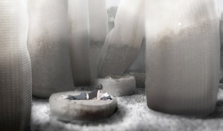
I’d almost been avoiding the PS1 Young Architects Award over the past several years because, without exception, its invited proposals were pretty uniformly disappointing, disheartening, and increasingly irrelevant. It’s hard to remember a time when I felt a proposal was architecturally challenging, didn’t pander to low-level social or spacial thinking, and was beautiful as well. Well, this year there was a proposal that actually made me pause, look hard, and think. And the more I thought about it, the more I liked it. The proposal was called “Bag Pile” by formless finder, based in NYC, essentially two young recent architectural grads from Princeton, Garrett Ricciardi and Julian Rose. I’m reposting some images here via Bustler. I’d reprint the mission statement from the formless finder website, as provoking as I think it is, but it’s probably better if you visit their site and just take a look at it.

It’s a bit weird, and almost jarring at first. It has a slightly apocalyptic feel to it, or at least suggestive of disorder and disarray. But that is exactly the point, really–it’s unlike anything that’s ever been proposed for what had become a tired, poor excuse for an event that was supposed to be a showcase of young architectural ideas.
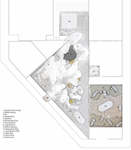 Their approach was fairly radical, yet upon reflection, completely logical. The principal ideas were to use something heavy instead of light. To explore analog, instead of digital. To use found versus fabricated. Formless versus form.
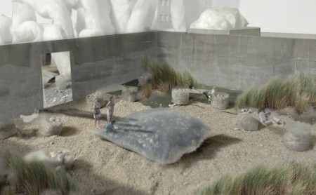 I’m happy to see such divergent and intelligent thinking about this space and its program. The images, which are eerie yet captivating, embody their proposed ideas perfectly. Unfortunately, this proposal won’t be built, but the fact that its ideas have been published and presented well, bode well enough.

As Charlie Sheen describes his model Patek Philippe Complicated Annual Calendar 5396: it’s “the only watch that keeps Warlock time.”
Indeed.

As much as I think it is a bit of a cop-out to post a link to a post I’d already written (which itself was a re-publication of a piece I’d written even longer ago), today is Groundhog’s Day and there is something about today that would seemingly make that ok. A long time ago, I wrote something about the movie Groundhog Day, by Harold Ramis and starring Bill Murray and Andie MacDowell. As a short recap, it is a movie about one day in the life of Bill Murray’s character, were he forced to repeat it infinitely. Its main premise derives from everything that could occur from a simple disturbance in how we experience time. I never turn down an opportunity to watch it. And in turn, I have never been disappointed after watching it. It is time-defyingly good.

In a small digression, I’ve been doing a lot of research on watches lately. Wrist watches, specifically. For some reason, I got in my head a while back that the next thing that I wanted was a handcrafted Swiss timepiece. So in between my time spent at work, cramming for ARE exams, managing my stock portfolio (heavy on gold-short on China), wagering on professional football, and managing to be not completely asocial, I’ve been reading about works by A. Lange & Sohne, Patek Philippe, Audemars Piguet, and Rolex. It’s hard not to want to own/experience one of those things once you know about them, and the horological world is a place where the knowledge is not easily exhausted. So I’ve been looking into buying one. Not anything digital, or electric, but the kind that are called “automatic” or “mechanical.” Maybe at some point one with “complications.” Run by gears, tourbillons, gyromaxes, oyster cases, and any matter of who-ha and what-not. You know, the kind that are a bit obscenely priced, and not altogether all that practical, but contain within each of them generations of knowledge derived from experiments, engineering, and a healthy dose of artisanship and inspiration. A while ago, in another post, I wrote about how a distinguishing idea about time is the primary contribution many famous architects have made to the concept of urbanity. Embodied in each watch is an idea about time, a theory of the meaning of that idea, and a mechanical execution of that idea. They’re wonderful things, and they remind me of how personal, relative, and individual our sense of time is.
These photographs of the office of Wikileaks are fairly remarkable, for various reasons. It seems straight out of a movie. Was that intentional? Why does an organization that supposedly tries to promote transparency need such an opaque environment? It seems a long way from the Bauhaus, when the idea of phenomenal and literal transparency was the architectural goal. It brings up an idea: as the world becomes more data-permeable, does that mean that material impermeability becomes more important?
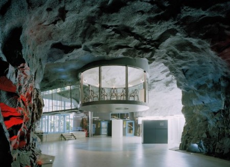
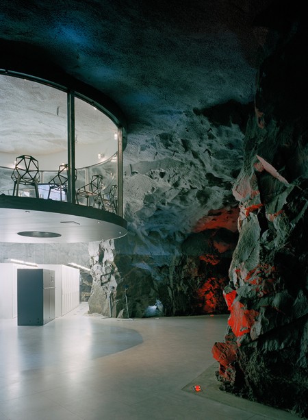
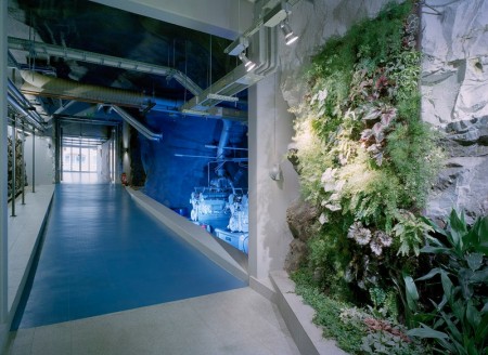
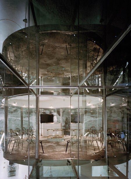
via Archdaily
Happy Holidays to everyone!
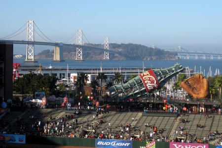
The San Francisco Giants just won the World Series, and as I stopped by a bar after work to catch the game (alongside some Monday Night Football), I thought about how baseball is the one sport in which a “perfect game” is one in which literally nothing happens (I also thought about how I missed PacBell Park or SBC Park or whatever they call it now). In any other sport, a game in which neither side scores would be described as “ugly,” “a bad ambassador to the sport,” or “an unmitigated disaster.” But tonight, watching the wonderful duel between Tim Lincecum and Cliff Lee, this sort of nothingness is a taut, tense exposition on control.
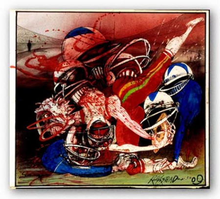
The contrast on the screens of the sports bar in Fort Greene that I stopped by on the way home from work was interesting–on the left: baseball (the most nostalgic of sports), on the right: American football (the most complex, interesting, and metaphorical of sports). It’s hard to imagine describing a single game of any other sport as “perfect,” as baseball does–what is a perfect soccer game? Perfect football game? The corollary for tennis, I suppose, would be what we called a “bagel” when I was a young tennis player: 6-0, 6-0. It was ugly and you didn’t want to watch it. But tennis is an individual sport. Baseball, ostensibly a team sport, is not quite an individual sport, yet not quite a true team sport. It’s more of an aggregation of individual actions. Just as how the Davis Cup or Ryder Cup ostensibly has teams, all three are essentially just a simple sum of individual results. They have nothing of the complex planning, coordination, and hierarchy, mixed with a hearty dose of controlled randomness, of American football–essentially, all the components of life in a modern, developed world. In contrast, soccer, I believe, will never catch on in America because it’s too Third World–the structure of the game is a continual flow of accreted improvisations across a field of undifferentiated actors with an absolute minimum of oversight and quantification. Planning, strategy, coaching, and analysis are second to the coherence and cooperation of all eleven players on the field per side. Very un-American.

Malcolm Gladwell & Bill Simmons
The best reason to watch American football, however, is as a supplement to reading the work of best young writers who are working in America today. There is a long history of American sports writing, from George Plimpton to Norman Mailer, and it often seems that the only sporting events of any cultural significance are the ones that are being written about by the best writers. A while ago, boxing captured the imaginations of a generation’s best writers. Today, I believe it is American football that has the attention of the brightest. My favorite writers, Bill Simmons and Chuck Klosterman, write extensively about American football, and are continual points of imaginative and inspiring writing.
Some new photos up over at quangtruong.com. . .